Overview
Sago Mini School is an educational subscription service offered by Sago Mini, the Canadian company known for its engaging and developmentally-appropriate apps for young children. Launched in 2019, Sago Mini School provides a comprehensive online platform designed to support early learning and kindergarten readiness.
Sago Mini School decided to add personalization options to the on-boarding flow of their School app -- including the name of child(ren) and birth year(s).
The goals of this project were to identify where in the on-boarding flow would be the best place to add this option, and present a couple of design options for how it would be executed.
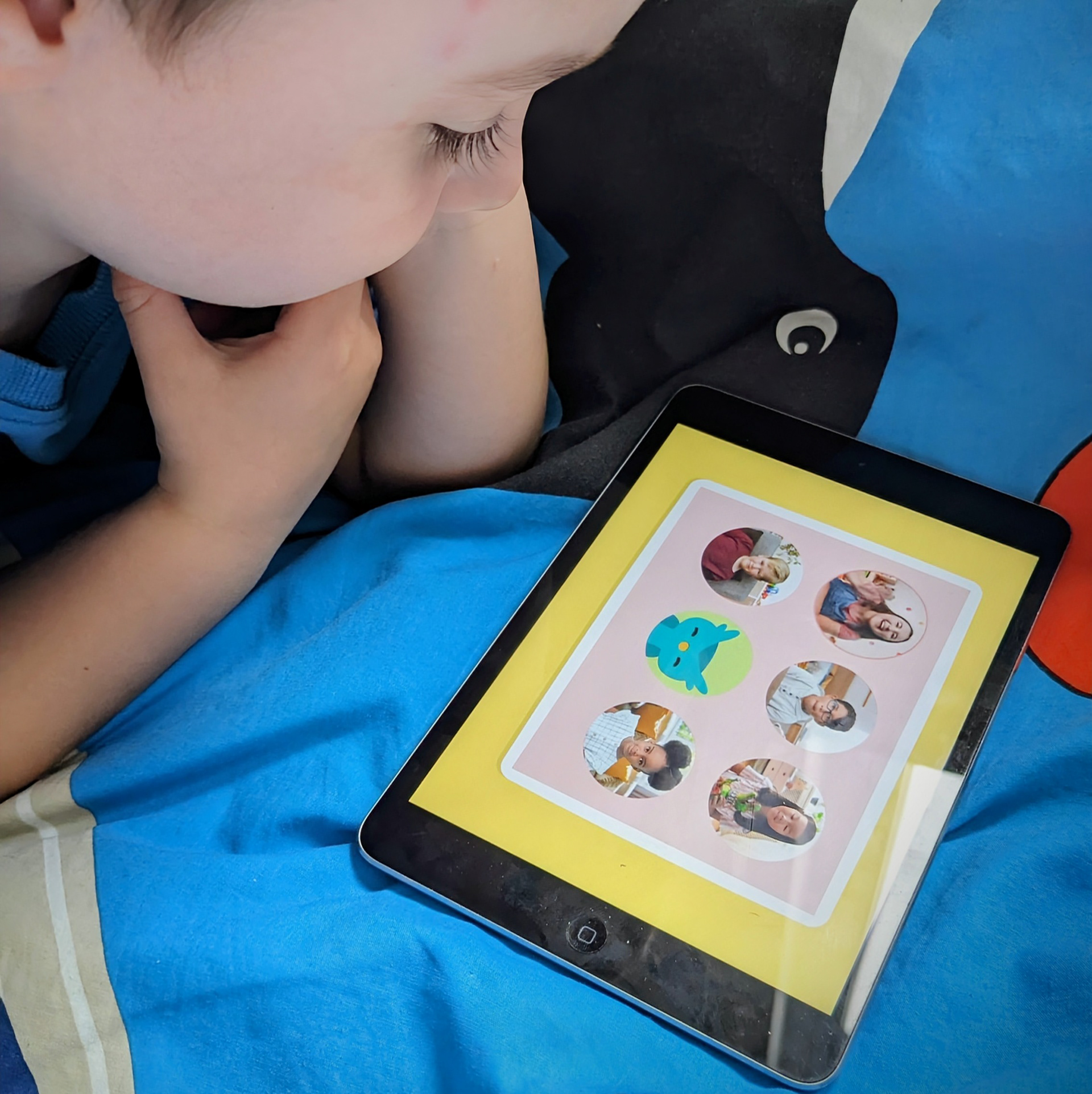
My son loved joining the "video calls"
Key Objectives
1. Have as many parents complete the personalization screen and provide their kid's First Name and Year of Birth as possible.
2. Minimize friction and drop-off of this step in the onboarding flow; get kids into the game as fast as possible.
3. Provide assurance to parents as to the purpose of collecting this data, and direct concerned parents to Sago Mini's Privacy Policy.
2. Minimize friction and drop-off of this step in the onboarding flow; get kids into the game as fast as possible.
3. Provide assurance to parents as to the purpose of collecting this data, and direct concerned parents to Sago Mini's Privacy Policy.
The Problem
Before adding a new feature, we needed to take a look at how many screens were already existing in the current onboarding flow. There were seven screens to load and/or tap through before getting into the app. The first problem was minimizing friction and drop-off, as seven was already plenty. The next problem was privacy, assuming a lot of parents might give pause to entering personal information.
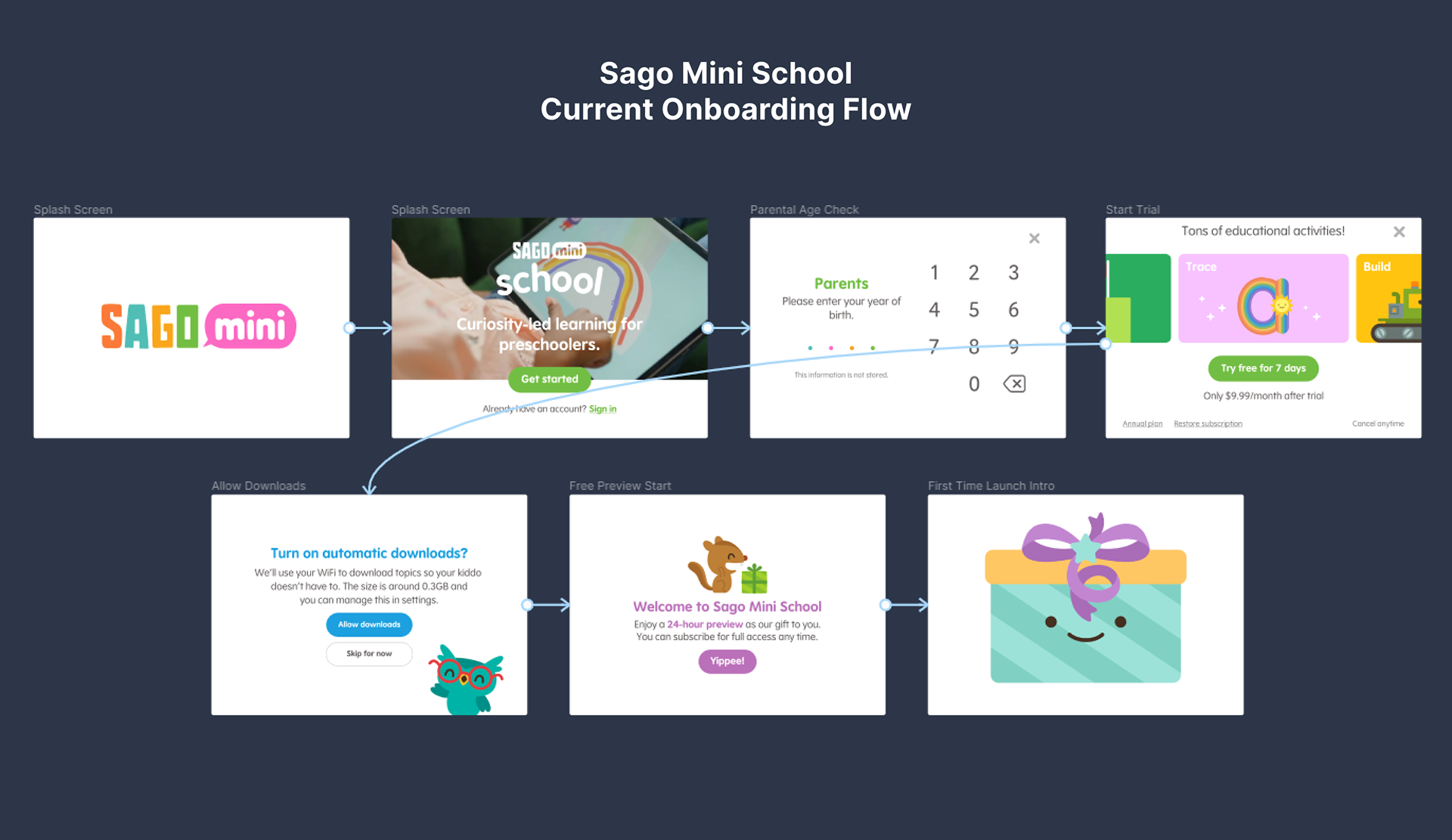
The onboarding flow, as it existed before.
Design Process
Our journey began with an initial kick-off meeting to get the scope and objectives of the project. This was followed by an audit of the current onboarding flow and competitor research to uncover areas of improvement and identify some options for how and where to implement the personalization flow.
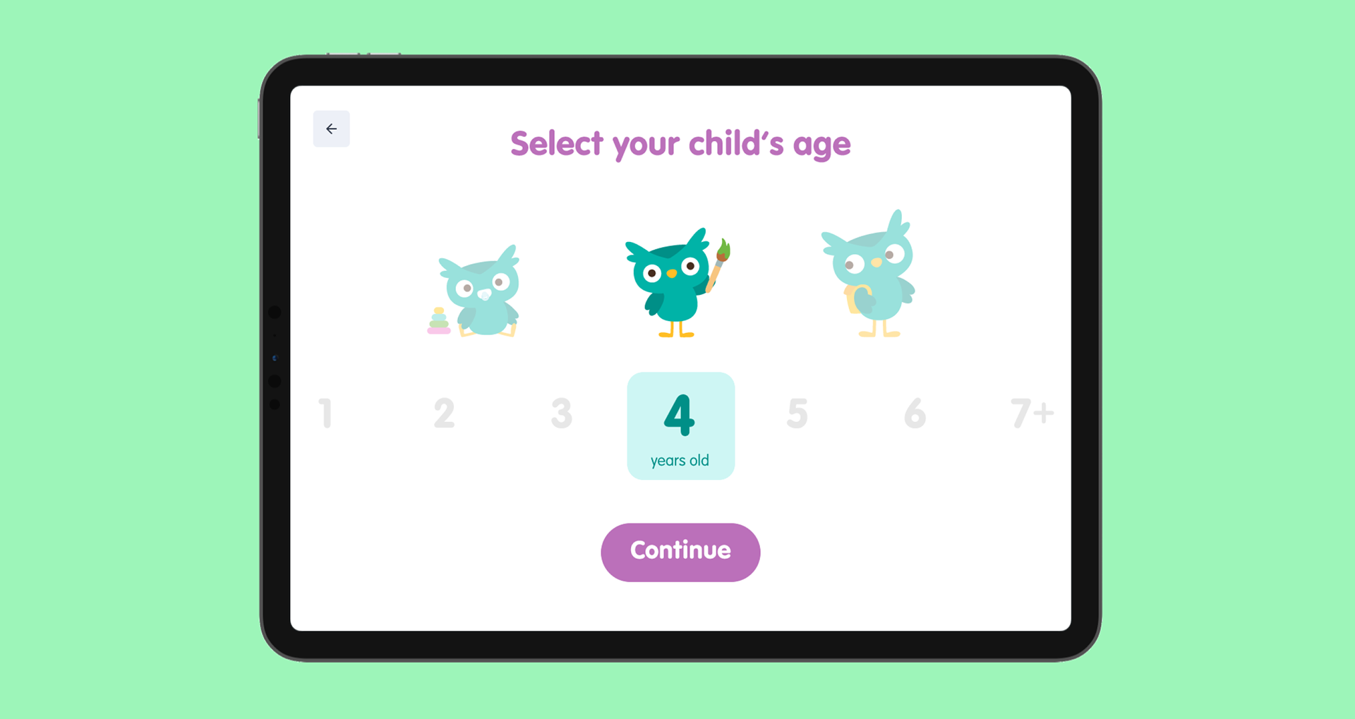
I began building wireframes for a fairly simple name input, followed by two different ideas for a date picker. I chose to introduce the personalization option immediately after the screen where parents input their date of birth. The idea being that the device would be in the parents' hands at this point, and not yet handed over to the child.
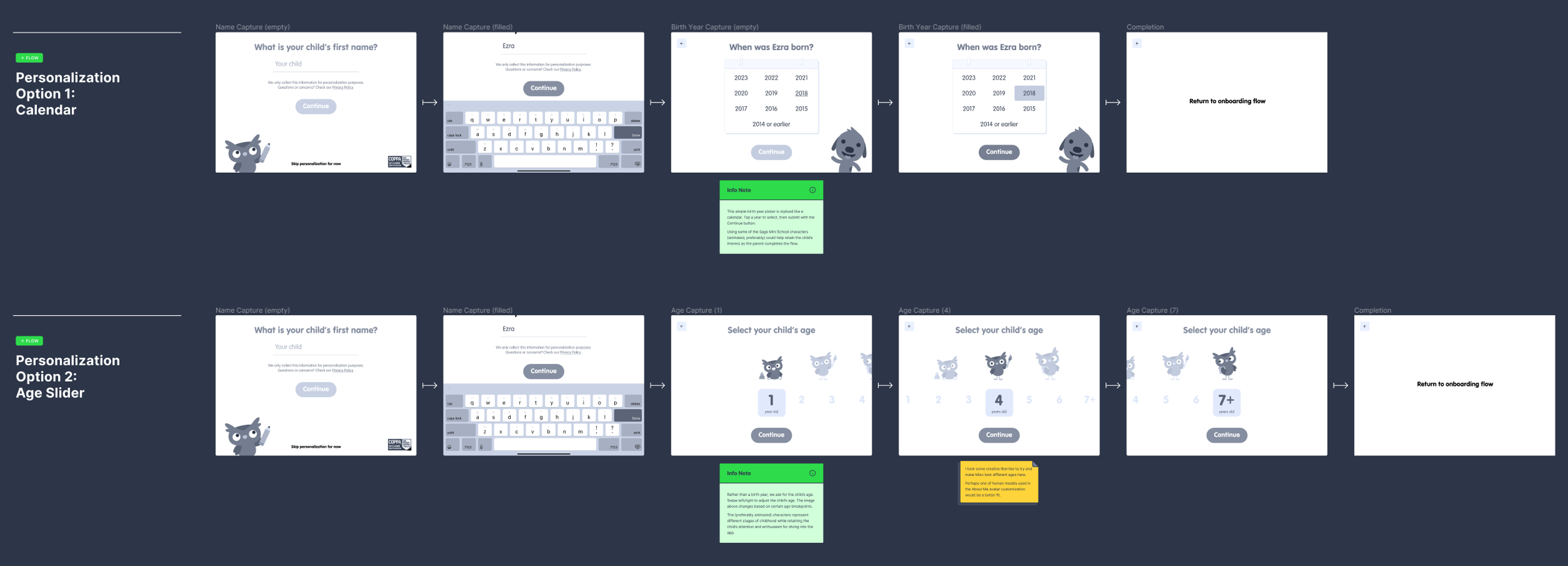
Two options that I presented for the personalization flow
Design Process
Leveraging illustrations created by the amazing art team at Sago Mini, I incorporated some of their characters into my medium-fidelity designs in order to not only resonate with their brand identity, but also retain the child's interest in what was happening on the screen.
The entire personalization process can be skipped in case of privacy concerns, but to assuage any fears, I included a statement that it would only be used for personalization purposes, along with the COPPA Safe Harbor Certification badge. If skipped, the personalization flow can be revisited at a later time through the parental controls menu.
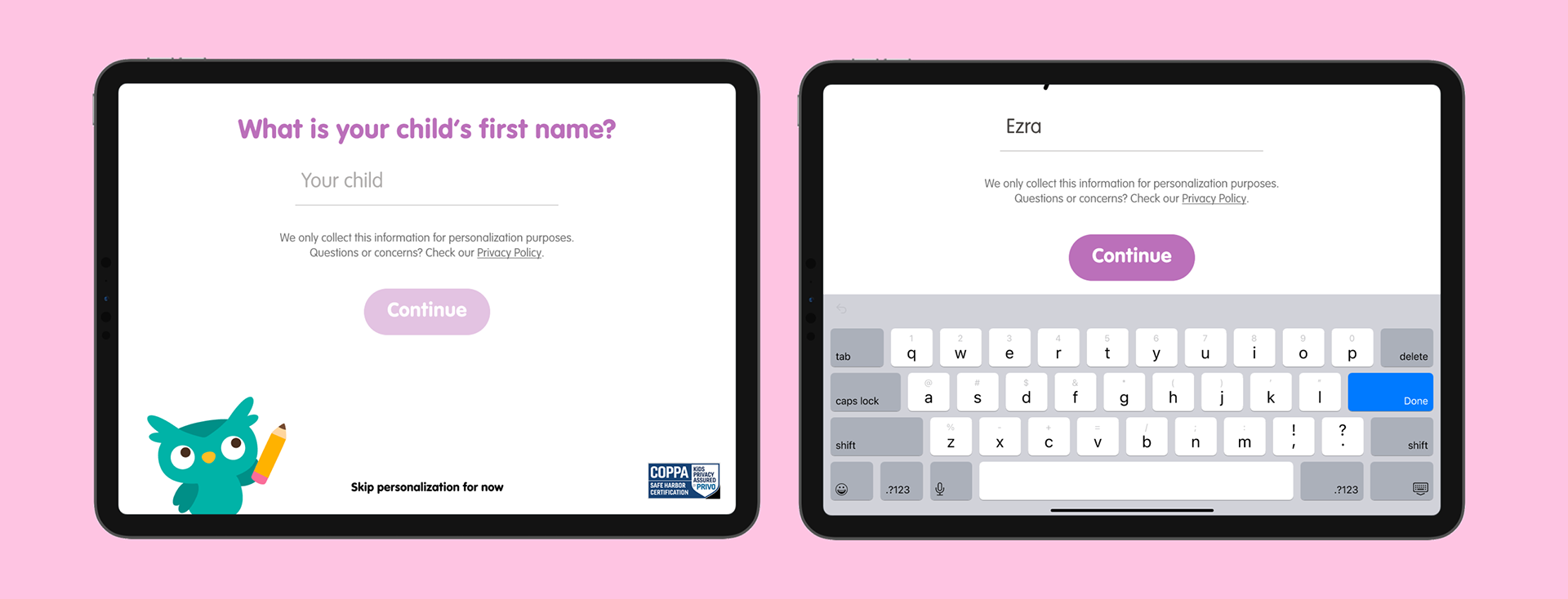
The layout for the name entry screen
For the name entry screen the design had to take into account how much real estate the keyboard would use, without losing access to the 'Continue' button. Miso the owl blinks and looks at the name entry field while waggling a pencil. A simple message assuring the user that this information will only be used for personalization purposes is included, along with a link to the privacy policy. The option to skip is there, but this flow can be returned to at any time through the parental controls menu.
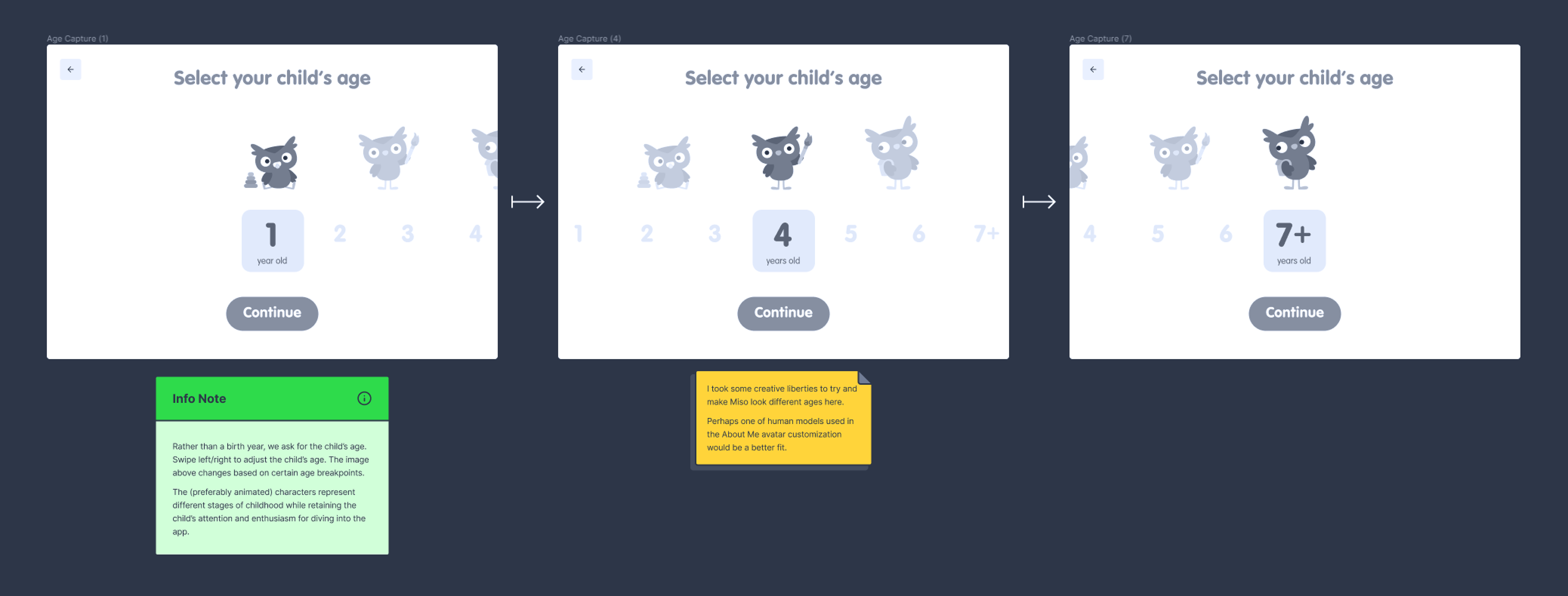
Wireframes for the sliding age picker
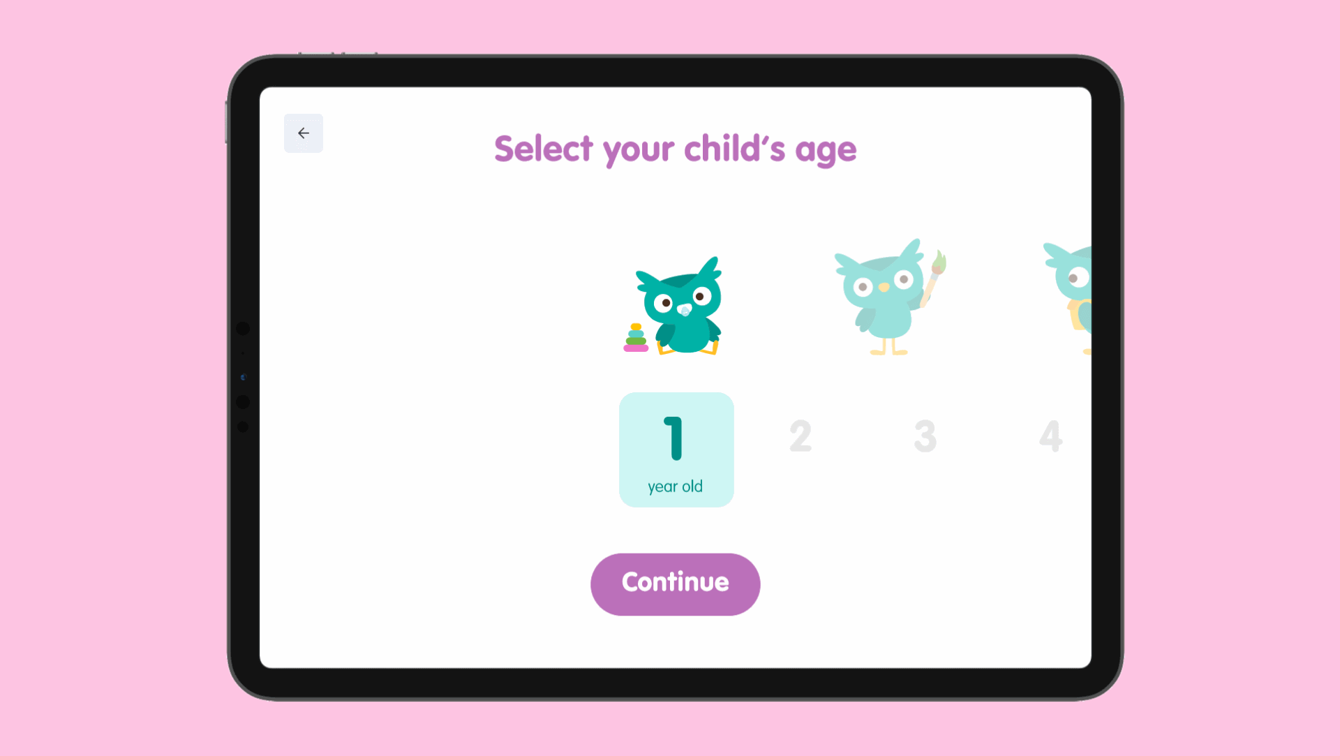
The sliding age picker in action
Two designs were presented for the age picker. The first option was a simple horizontal scrolling slider with age ranges being represented by a growing Miso, scaling up in size and showing her age group's common interests/activities.
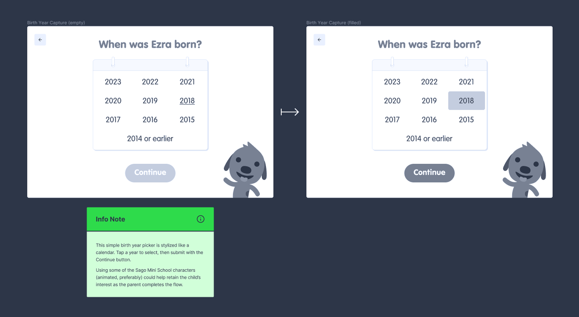
The second design option was a very simple calendar featuring Harvey the dog. Presenting two options would meet the client's needs for whichever kind of age indicator their data team preferred, and presenting both totally blew them away.
Results and takeaways
I created my mockups in Figma with a fully working prototype for both flow options for the product team to poke through and ask questions. I presented the designs via video call and showed the team my ideas and explained my reasoning behind them both, along with design notes and recommendations.
I received positive feedback about my documentation and my customization of their art assets. I was very open and receptive to feedback about my work and I wasn't afraid to offer up critical feedback about the product, including recommendations for which onboarding screens could possibly be removed in order to reduce time getting into the app.